Una questione di stile
Ovvero: come un progetto di branding tipografico sul tema della moda ci ha spinto ha spinto ad un viaggio di ricerca lungo due anni per sviluppare l'ultima famiglia di caratteri di Zetafonts: Coco Gothic.
[english text]
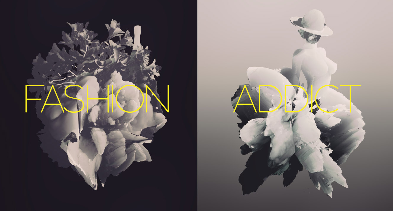
Nel maggio del duemilatredici, al momento di realizzare l'immagine per la manifestazione Lucca Comics & Games 2013, ci venne proposto un tema preciso quanto ambizioso: "Questione di stile".
La kermesse lucchese, un colosso dell'intrattenimento con un pubblico di centinaia di migliaia di young adults, voleva presentarsi con un'immagine rinnovata che coniugasse le visioni pop di fumetto, giochi e videogiochi alla tradizione della moda e del made in italy. Una sfida ardita, che comprendeva la direzione artistica del team di illustratori di Riot Games, più abituati alle lande fantasy di League of Legends che alle passerelle di Parigi.
La risposta non poteva essere, per noi, che nella scelta di un branding tipografico, con lo sviluppo di un carattere in grado di esprimere l'aura di eleganza e stile associata nel mondo al fashion design italiano. Il carattere creato per l'occasione, chiamato Fashion Addict, è diventato il primo step di un progetto di ricerca che ci ha occupato per oltre due anni: il disegno di un carattere dotato di una serie di varianti ispirate agli stili e alle mode del Novecento.
Le mode sono una delle componenti misteriose e ineludibili del visual design.
Nonostante le migliori intenzioni di progettare guidati dalle funzionalità, dal minimalismo e dalle necessità di problem solving, arriva sempre il momento nel quale ci si trova a fare scelte estetiche. Ci accorgiamo allora che quello che crediamo essere il nostro gusto personale non è altro che il prodotto dell'influenza di mode e stili dominanti. A Studio Kmzero questo rapporto con gli stili è quotidiano - dai tempi in cui abbracciavamo con entusiasmo il grunge o piuttosto il flat design. Adesso, in un momento in cui il design hipster di matrice vintage ci inonda di grafica ispirata al nordamerica degli anni '30 e '40, è difficile resistere alla tentazione di risolvere un progetto semplicemente con un Neutra un po' ruffiano. Senza casomai rendersi conto di stare utilizzando il linguaggio del Bauhaus piuttosto che quello dell'Art decò newyorkese, e rischiando di confondere le molte e belle esperienze visuali di un periodo pieno di ricerca e di fascino alimentato dalle avanguardie artistiche di inizio Novecento.
Desiderosi di comprendere meglio le fasi dell'evoluzione del gusto tipografico nel secolo scorso, abbiamo sognato una famiglia di caratteri che funzionasse da enciclopedia di stili. Ci siamo immaginati un carattere che potesse facilmente passare dalla Vienna di Egon Schiele alla Parigi di Cassandre, dalla Roma del Ventennio alla Svizzera degli anni '50. Una specie di macchina del tempo in forma di carattere tipografico, per raccontare la storia dello Stile e per raccoglierne alla fine in sé tutte le diverse manifestazioni. Abbiamo chiamato questo carattere, figlio dal Fashion Addict lucchese, Coco Gothic, in onore a Coco Chanel, icona senza tempo di stile e eleganza.
Finalmente oggi, dopo mesi di lavoro, rendiamo disponibile questa famiglia sul sito della nostra fonderia digitale Zetafonts.
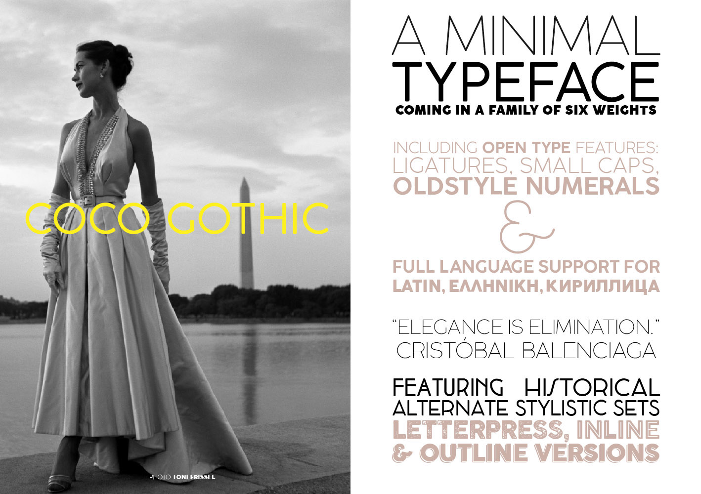
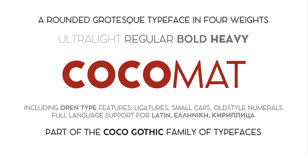
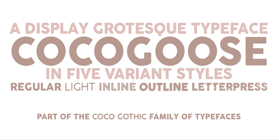
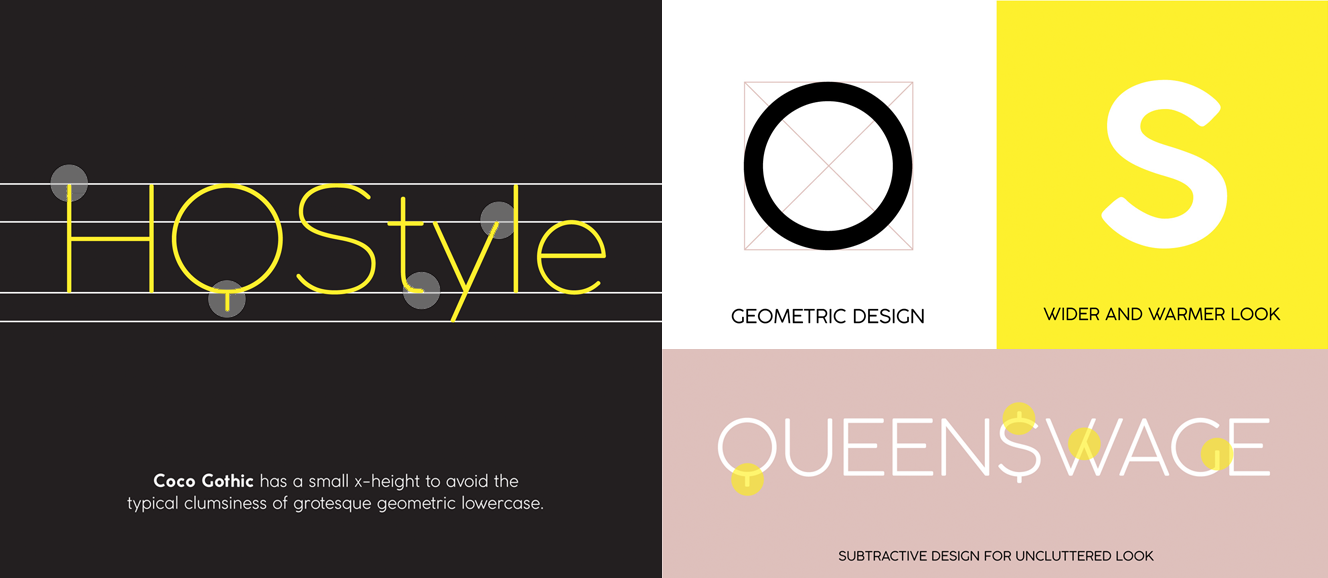
Coco Gothic è un sans serif geometrico nella tradizione dei grotesque modernisti come Futura e Avenir. Le forme fredde e geometriche di questi caratteri razionalisti sono state ammorbidite da alcune correzioni visuali e dall'utilizzo di angoli lievemente arrotondati che danno al carattere un lieve effetto "sporco" da stampa tradizionale.
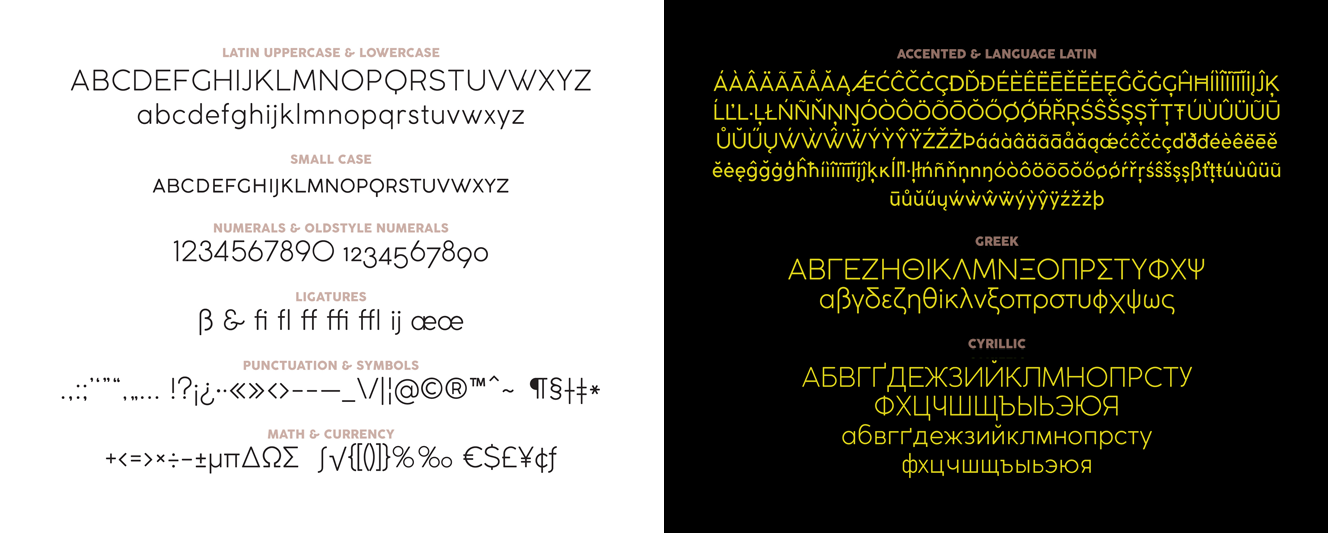
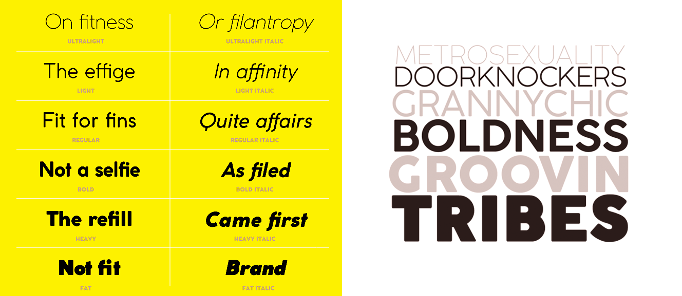
Anche se Coco Gothic è nato come un carattere ultrasottile, abbiamo sentito ben presto il bisogno di disegnare un peso medio ed anche dei grassetti molto incisivi. Alla fine ne sono risultati sei pesi, dall'ultralight al fat face, per ognuno dei quali abbiamo disegnato oltre novecento caratteri, necessari a visualizzare accenti e lettere speciali non solo per le lingue che usano l'alfabeto latino, ma anche per quello greco e per quello cirillico.
La caratteristica saliente del Coco Gothic è quella di utilizzare la tecnologia Open Type per visualizzare una serie di stili alternativi che ispirati ai decenni del secolo scorso, ognuno dei quali ha generato un nuovo carattere tipografico.
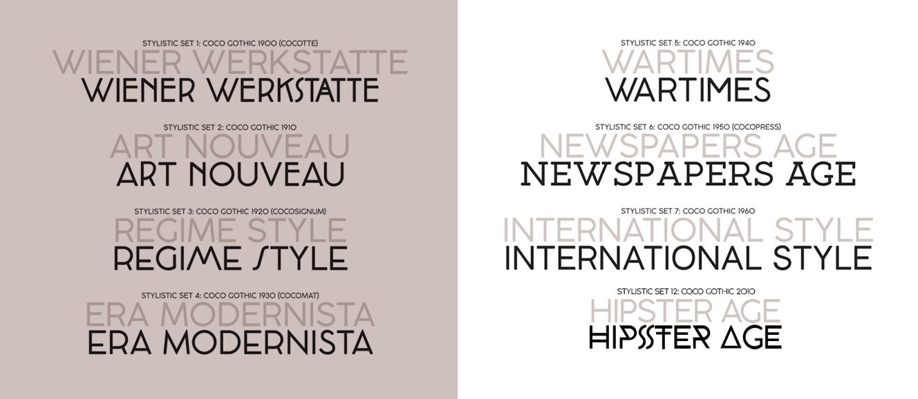
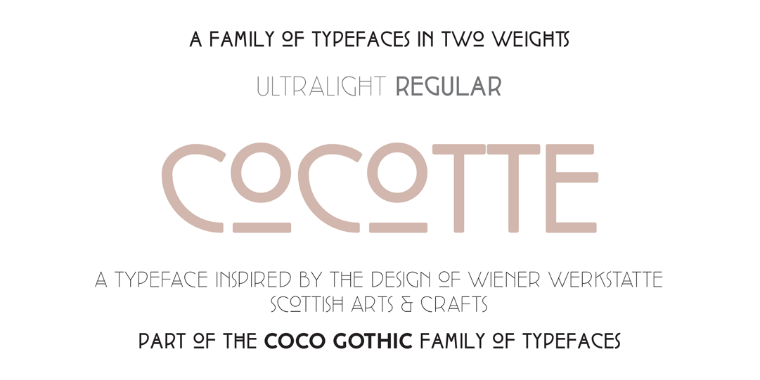
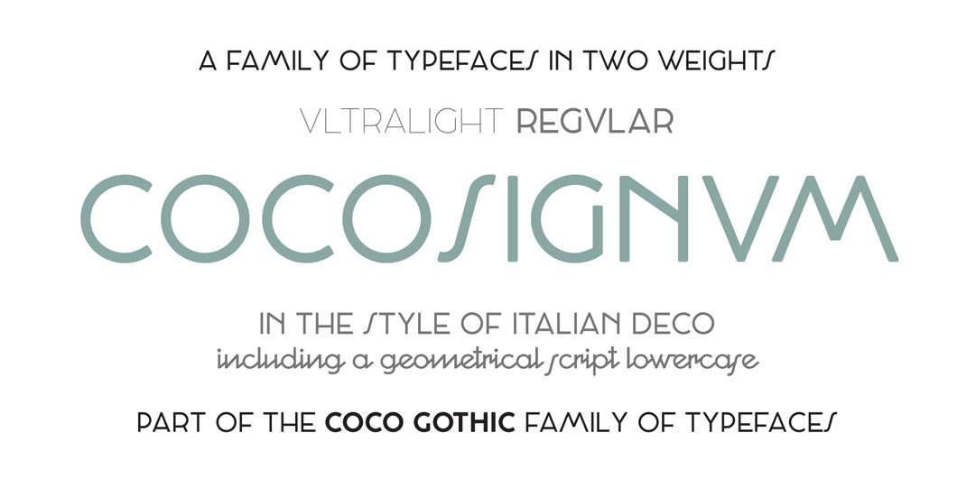
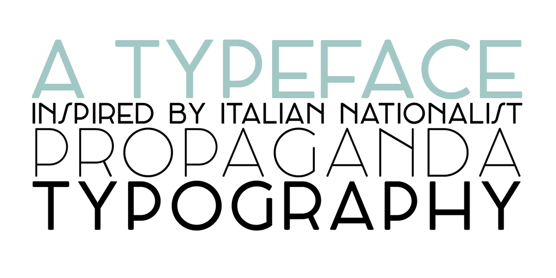
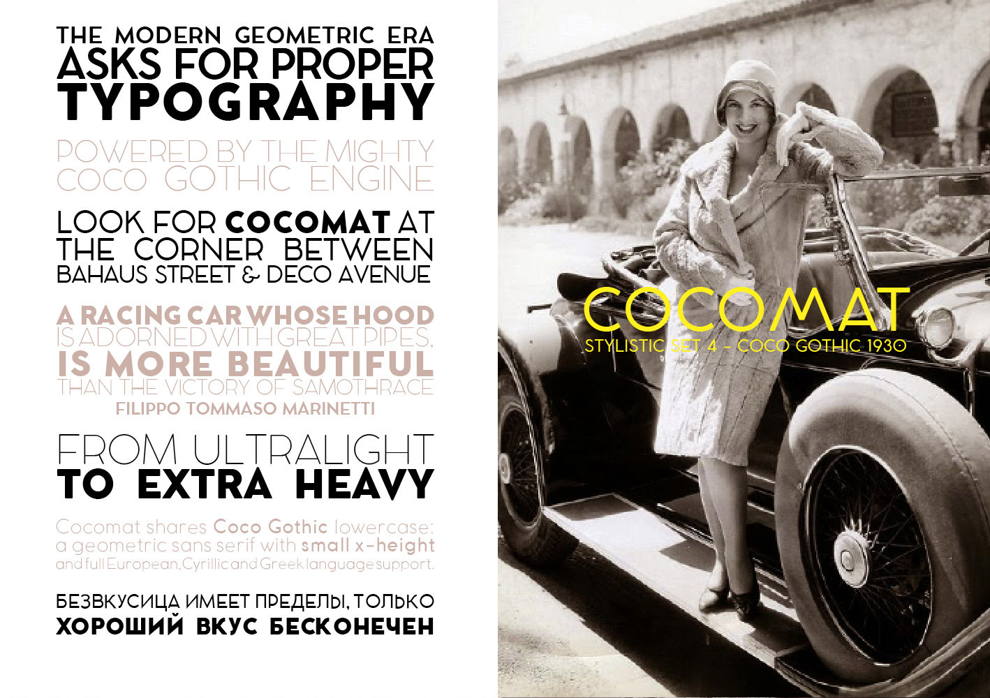
Così Cocotte (Coco 1900) ha forme ispirate alla Secessione Viennese e al lettering di Charles Rennie Mackintosh, Cocosignum (Coco 1920) ha le forme tipiche delle iscrizioni fasciste italiane e Cocomat (Coco 1930) si ispira all'Art Deco di matrice internazionale e modernista.
Come tutti i nostri caratteri tipografici, Coco Gothic è disponibile gratuitamente per il download e può essere liberamente utilizzato per i propri progetti non commerciali. Nei prossimi mesi svilupperemo il progetto continuando a pubblicare le diverse varianti come famiglie complete, ma intanto potete scaricare e utilizzare il carattere base.
Siete invitati tutti a partecipare al nostro viaggio nella dimensione storica della grafica, alla ricerca dei valori dello stile al di là delle mode.
Prova gratuitamente Coco Gothic sul sito Zetafonts!
[Un ringraziamento a Bruno La Versa per le illustrazioni, a Anastasia Yakovleva per la consulenza sul cirillico e a Elia Chiusa per la collaborazione]
While working at the branding for Lucca Comics & Games Festival 2013, we were proposed an ambitious claim: "A Style Issue".
The organizers of Lucca Festival, a huge event with hundreds of thousands of attendees, wanted to renew their image combining a the pop imagery of comics, roleplaying games and videogames with the italian High Fashion tradition. A bold challenge, which included the art direction of the team of illustrators at Riot Games, more accustomed to League of Legends werewolves than to Paris' catwalks. We choose a typographic branding, developing a typeface that could express the aura of elegance and style that is usually associated with the image of italian fashion design. The font created then, called Fashion Addict, became the first step of a research project that has kept us busy for more than two years, spawning more than thirty typefaces in the meantime: the design of a typeface with variants inspired by the styles and historical trends of the twentieth century .
Trends are a mysterious and unavoidable component of the visual design. Despite our best intentions to work driven by functionality, minimalism and problem solving, there often comes a time when we find ourselves making aesthetic choices: is then that we realize that what we believe to be our personal taste is nothing more than the product of the influence of the dominant trends and styles. At Studio Kmzero we have a long story of involvement with visual trends - from the days when we embraced with enthusiasm grunge aesthetics to when we fell in love for flat design. Today, when hipster vintage design floods us with graphics inspired by northamerican thirties and forties, it's hard to resist the temptation to solve a project by simply pimping it with Neutraface. Forgetting why are we using the language of the Bauhaus rather than New York Art Deco, and sometimes confusing the many and beautiful visual experiences of the early twentieth century. A period full of research and fascination fueled by the artistic avant-gardes.
Eager to better understand the evolution of typographical taste in the last century, we pictured a font family that was also an encyclopedia of styles. We imagined a typeface that could easily switch in mood from Egon Schiele's Vienna to Cassandre's Paris, from Fascist Rome to Switzerland in the 50s. A sort of time machine in the shape of typeface, to travel the story of the trends gathering all its influences. We called this typeface, derived from Lucca Fashion Addict, Coco Gothic, in honor of Coco Chanel, timeless icon of style and elegance.
Finally today, after months of work, we make available this family on the site of our digital foundry Zetafonts.
Coco Gothic is a geometric sans serif in the tradition of the modernists grotesques like Futura and Avenir. The cold and geometric shapes of these rationalist typefaces have been softened by some visual corrections and the use of slightly rounded corners that give the characters a very light "smeared" effect - as in traditionally printed letters.
Although Coco Gothic was born as a ultralight, we soon expanded it with a regular and an heavy weight. Eventually we developed six weights, ultralight to fat face, for each of which we have designed over nine hundred characters, to cover accents and special characters not only for languages that use the Latin alphabet, but also for the Greek and for Cyrillic.
The main feature of Coco Gothic is the use of Open Type technology to display a series of alternative styles that were inspired by the decades of the last century, which we are developing in new typefaces generated a new typeface.
So Cocotte (Coco 1900) has shapes inspired by the Wien Secession and Charles Rennie Mackintosh lettering, Cocosignum (Coco 1920) has the typical futurist shapes of Italian fascist inscriptions and Cocomat (Coco 1930) is inspired by Art Deco and International Modernism.
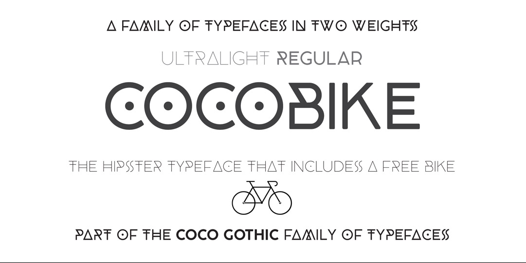
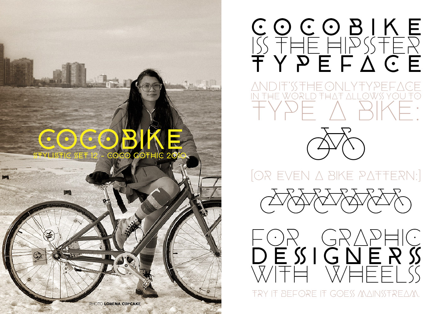
There is no shortage of versions inspired by more recent decades, including Cocobike (Coco 2010), influenced by current hipster fashion.
Like all of our typefaces, Coco Gothic can be freely download and used for non-commercial projects. In the coming months we will develop the project continuing to publish the variants as complete families, but in the meantime you can download and use the base typeface, that contains the hystorical alternates as Open Type stylistic sets. You are all invited to participate in our journey through the historical styles of typeface design in search of the values of elegance beyond trends.
Try it for free on the site Coco Gothic Zetafonts!
[Thanks to Bruno La Versa for illustrations, to Anastasia Yakovleva for cyrillic help and Elia Chiusi for proofreading]