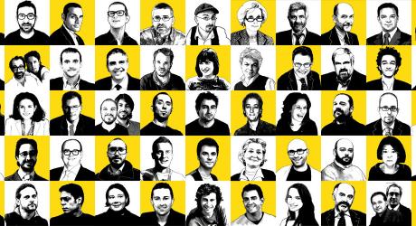
Some responses to ego[n] magazine
Last months have been very busy for ego[n] magazine. We presented the mag at Attraversamenti graphic design festival, at NullAosta graphic design convention and at al Festival della Creatività in Florence. We produced a limited edition of the mag including a tee-shirt (handsUpForEgo[n]) with streetwear brand Gold. We earned some nice reviews online (Segnaletica, Fridge, BallaDora). Expecially pleasing for us was the flattering review we got from SocialDesignZine, Italy's leading graphic design blog, done by well known designer and illustrator Andrea Rauch. We reproduce it here, translated in english for our non-italian speaking readers:
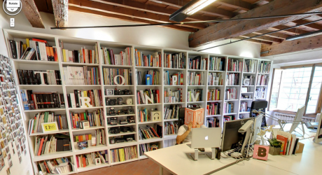
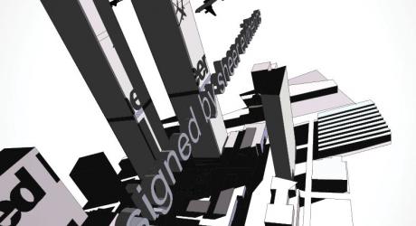
Kmzero studio is in downtown Florence, in via Calzaiuoli at number 9. By looking out from the studio windows you can enjoy the show of touristic nomadic transhumance: tourists that follow their leader's little umbrella towards the city cathedral while other move in the opposite direction towards Palazzo Vecchio. Japanese and Korean people dressed in gray move South, while American ladies with transparent raincoats and crazy haircuts move North. An extraordinary show for someone who's not used to it. For the people who are accustomed it's probably a good impulse for their self esteem and helps to develop a strong, invulnerable ego. It's probably due to this daily experience of life and work that the designers at Kmzero (Francesco Canovaro, Debora Manetti, Cosimo Lorenzo Pancini) have named the first number of their magazine/book/whatever (it's quite difficult to define it!) ego[n]. Meaning: "ego" at the n-th power, a fortified, powerful, ready for everything ego. But, naturally, we could read their work in the opposite way. This huge mass of graphic material, images, signs and unfinished issues could also be interpreted as a way for them to merge with a visual world that is ample and full of chances to explore in search of a new idea or visual experience. Developing an awareness that borders with humility (a gigantic superego and humility, what a wonderful oxymoron!) the authors are able to tie together in this box such different issues as the roots of graphic design in Florence, a comic book on the WTC attack, stickers and notebooks, truetype fonts, travel logbooks, guest contributors (from Stefan Sagmeister to Ed Fella), and elegant visual explorations on the dot porn business. And there's even more in this eclectic mix of juvenile curiosity and professional know how. Add to this an extreme control of the various printing techniques (from uv coating to die cutting, to unusual folding) that manages to create that feeling of a "ordered and wonderful chaos" that constitutes one of the strong points of contemporary graphic design. The pages of ego[n] challenge us as readers, but after the initial drawback they capture us in a intense reading experience - somehow unexpected due to our rational and often lazy approach to the printed page. A good boxed edition and a great demonstration of style, that deserves a try. More more information can be found on the Red Publishing web site.